Screens
→ → →
Use the Screens utility to create and design XDMB screen content. The following provides an overview of the homepage of the Screens utility:
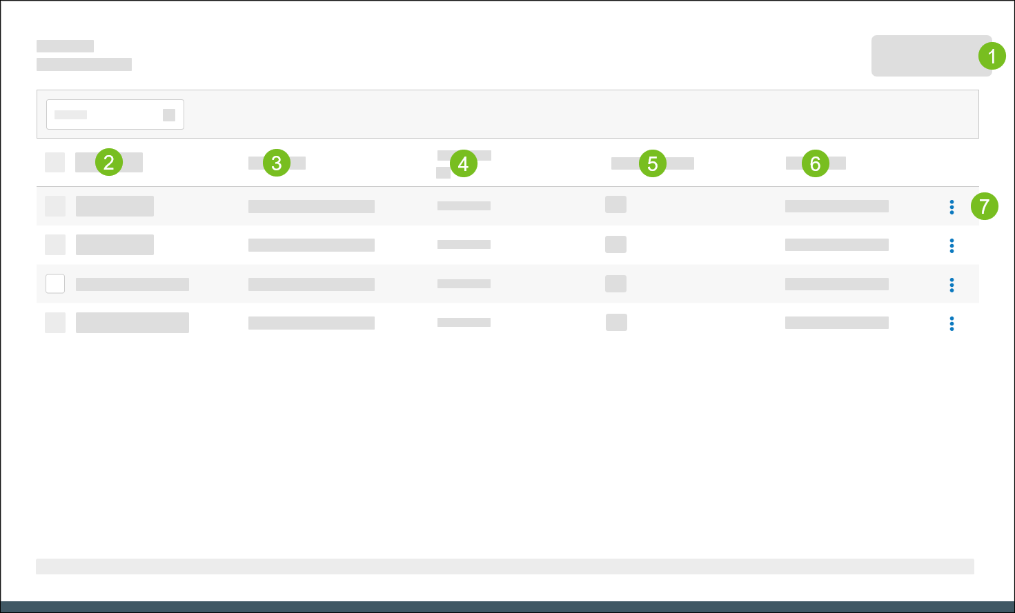 |
1 | Create a new screen. Use the Screen Designer to configure the screen components, including images, videos, and order confirmation units (OCU). To create a customer-facing tip screen, see Create Tip Screen. | |
2 | Screen Name | Specifies the name of the screen. |
3 | Description | Provides a description of the screen. |
4 | Resolution | Specifies the screen resolution. Select All under the column header to filter the screen list by resolution. |
5 | Content Layouts | Specifies the number of Content Layouts mapped to the screen. Select the Content Layouts value for a particular screen to view the names of each mapped layout. |
6 | Last Update | Specifies the date/time the screen record was last updated. |
7 | 3-Dot Menu | From the dropdown, select an action to perform on the screen: |
Screen Designer Overview
→ → →
Use the Screen Designer to add and configure the content that is displayed on a screen.
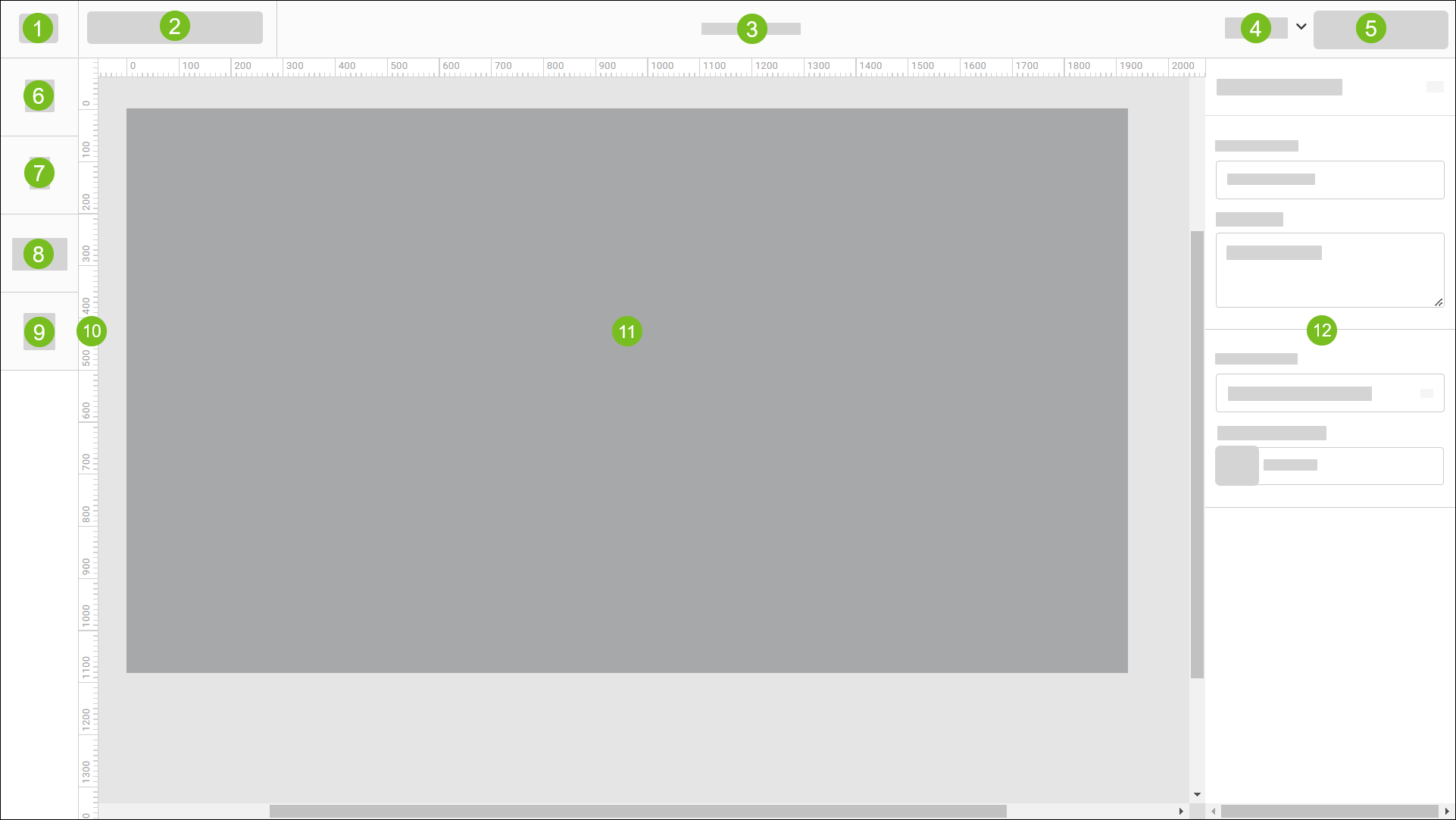 |
1 | "Hamburger" Menu | Select the "hamburger" icon to access the following options:
| ||||||||||||
2 | Toolbar | From the toolbar, access the following tools:
| ||||||||||||
3 | Screen Title | Displays the name of the screen. Specify the screen name in the Screen Name field of Screen Settings. | ||||||||||||
4 | Zoom Settings | From the dropdown, select a zoom setting:
| ||||||||||||
5 | Preview Screen | View a preview of the current screen in a separate browser tab. | ||||||||||||
6 | Add Media | Upload image and video files and configure their size and location on the screen. | ||||||||||||
7 | Add Text | Add text components and define their size, location, font, and color. | ||||||||||||
8 | Add Component | Add and format the following components:
| ||||||||||||
9 | Manage Layers | Open the Layers pane of the Screen Designer and manage the content layers of the current screen. | ||||||||||||
10 | Ruler | When Show Rulers is enabled from the "Hamburger" menu, a ruler is displayed along the vertical and horizontal perimeters of the screen. | ||||||||||||
11 | Screen | Provides a visual representation of the screen. Select individual components from the screen to configure its respective settings. | ||||||||||||
12 | Component Settings | From this pane, configure the settings for the currently selected screen component. |


Create Screen
→ → →
To create a new screen:
From the upper-right of the Screens homepage, select Create Screen to open the Screen Designer.
From the right pane, define the following:
Field
Description
Screen Name
Type a name for the screen.
Description
Type a description of the screen.
Screen Size
From the dropdown, select the desired resolution for the screen.
Background Color
Select the color tile to select a background color for the screen.
Use the Screen Designer to add and configure the screen components:
Component
Description
Add a collection of components that are displayed consecutively on an infinite loop at a specified duration. A carousel can include any combination of images, videos, and/or price components.
For example, a carousel rotation might include two (2) images of the current promotional items (where each image is displayed for five (5) seconds), followed by an eight (8) second video.
Add and format a product pricing component. Optionally associate a product with the component.
Add text components and define their size, location, font, and color.
Upload video files and configure their size and location on the screen.
Valid file types: MP4, MOV, WEBM
Maximum file size: 100MB
Upload image files and configure their size and location on the screen.
Valid file types: PNG, JPEG, GIF, SVG
Maximum file size: 30MB
Add a customer-facing order confirmation unit (OCU) to display order details to the customer, including:
Order Item list with respective quantities and modifiers.
Order total summary, including the sub total, tax, and applied discounts.
The benefits of an OCU include:
Improves order accuracy and speed-of-service.
Provides up-sell and cross-sell opportunities at the time of purchase.
Reduces operating expenses and employee theft.
Enhances guest satisfaction.
Nota
The screen content is automatically saved after each user action.
From the upper-right of the Screen Designer, select Preview Screen to see a preview of the screen in a browser window.
From the upper-left of the Screen Designer, select the "hamburger" icon.
From the dropdown, select Exit Screen to exit the Screen Designer.
Add Image
To add an image:
From the upper-left of the Screen Designer, select Media.
From the file browser, select and add the image file.
The image is added to the screen workspace and to the Layers pane on the left.
From the right pane, define the following:
Field
Description
Name
In the provided field, type a name for the image.
Select the lock icon to make the component properties non-editable.
Toggle the eye icon to hide/show the component.
X and Y
Type the desired X and Y coordinates for the component.
When the position of the component is manually adjusted, the X and Y field values are updated automatically.
W and H
Type the desired width and height of the component.
When the width and height of the component are manually adjusted, the W and H field values are updated automatically.
Scale Proportionally
Enable this option to automatically update the X, Y, W, and H values proportionally when one value is changed.
Add Media Carousel
A media carousel is a collection of components that are displayed consecutively on an infinite loop at a specified duration. A carousel can include any combination of images, videos, and/or price components.
To add a media carousel:
From the left pane of the Screen Designer, select Component.
From the Component menu, select Media Carousel.
From the file browser, select the component(s) to add to the carousel.
Sugerencia
Hold down Crtl on the keyboard to select multiple components from the same folder.
From the right pane, define the following:
Field
Description
Name
Type a name for the carousel. The default name is "Carousel".
Select the lock icon to make the component properties non-editable.
Toggle the eye icon to hide/show the component.
X and Y
Type the desired X and Y coordinates for the component.
When the position of the component is manually adjusted on the screen, the X and Y field values are updated automatically.
W and H
Width and height of the carousel. The values are automatically set to the width and height of the largest component included in the carousel. The values are non-editable.
Transitions
From the dropdown, select the desired effect to use when transitioning from one component to another.
From the lower-right of the right pane, sort the carousel components and specify the amount of time to display each component:
Select and drag the control to the left of the listed components to sort them in the desired sequence.
In the Duration(s) field for each listed component, type the number of seconds to display the component before transitioning to the next component in the carousel.
Select Auto to play the video at its original length. This option is only available for video files.
The Loop field specifies the number of seconds it takes to cycle through one loop of the carousel.
From the Layers pane, select each component in the carousel and configure its respective settings.
From the Layers pane, add additional components to the carousel as needed.
Add Product Pricing Component
Nota
Product Pricing components are automatically formatted in accordance with the regional settings defined for the company.
Define regional settings in the Regional Settings section of the Company/Site Preferences editor.
To add a Product Pricing component:
From the left pane of the Screen Designer, select Component.
From the Component dropdown, select Product Pricing.
From the right pane, define the following:
Field
Description
Name
In the provided field, type a name for the component.
Select the lock icon to make the component properties non-editable.
Toggle the eye icon to hide/show the component.
X and Y
Type the desired X and Y coordinates for the component.
When the position of the component is manually adjusted on the screen, the X and Y field values are updated automatically.
From the Text section on the right pane, select formatting options:
Option
Description
Font
From the dropdown, select a font to apply to the text.
To upload custom fonts, see Fonts.
Size
In the provided field, type the desired font size.
Style
From the dropdown, select a font style.
Color
From the color field, select a font color. The HEX# for the selected color is displayed.
Justification
From the right of the color field, select a justification option.
(Optional) From the Product section of the right pane, select Add Product to associate a specific product with the Pricing Component.
The name and ID of the selected product are displayed in the Product field.
Enable Show Max Spacing to view the maximum amount of space the component could occupy.
From the lower section of the right pane, define the following:
Option
Description
Decimal Places
Number of decimal places to display in the value.
Show Currency Symbol
Display currency symbol with currency value.
Show Decimal Point
Display decimal point and display decimal values in the same font size as the integer value.
If this option is NOT selected, the decimal point is NOT displayed. The decimal values are displayed in smaller font to distinguish them from whole integer.
Show Integer When Zero
Display leading zero (0) in whole integer when zero (e.g. 0.99).
Show Decimal When Zero
Always display the decimal value even when the decimal value is zero (0) (e.g. $1.00).
Swap Text When Sold Out
If the product associated with the Pricing Component becomes unavailable at the site, the product price on the screen is replaced with the Sold Out Text.
In the Sold Out Text field, type the text to display when the product is unavailable.
Add Text
From the upper-left of the Screen Designer, select Text.
From the right pane, define the following:
Field
Description
Text
In the provided field, type the text to display on the screen.
Select the lock icon to make the component properties non-editable.
Toggle the eye icon to hide/show the component.
X and Y
Type the desired X and Y coordinates for the component.
When the position of the component is manually adjusted, the X and Y field values are updated automatically.
W and H
Type the desired width and height of the component.
When the width and height of the component are manually adjusted, the W and H field values are updated automatically.
From the Text section on the right pane, select formatting options:
Option
Description
Font
From the dropdown, select a font to apply to the text.
To upload custom fonts, see Fonts.
Style
From the dropdown, select a font style.
Size
In the provided field, type the desired font size.
Color
From the color field, select a font color. The HEX# for the selected color is displayed.
Justification
From the right of the color field, select a justification option.
Auto-Width
Adjust the width of the text box automatically to fit the content.
Auto-Height
Adjust the height of the text box automatically to fit the content.
Line Height
Adjust the height of the line of text. Type the desired height in the provided field.
Add Video
To add a video:
From the upper-left of the Screen Designer, select Media.
From the file browser, select the video file.
The video is added to the screen workspace and to the Layers pane on the left.
From the right pane, define the following:
Field
Description
Name
In the provided field, type a name for the video.
Select the lock icon to make the component properties non-editable.
Toggle the eye icon to hide/show the component.
X and Y
Type the desired X and Y coordinates for the component.
When the position of the component is manually adjusted, the X and Y field values are updated automatically.
W and H
Type the desired width and height of the component.
When the width and height of the component are manually adjusted, the W and H field values are updated automatically.
Infinite Play
Enable the Infinite Play toggle to play the video in a continuous loop.
Disable the toggle to play the video a specified number of times.
In the Play Count field, type the number of times to play the video.
Align Components
When configuring a component, the following alignment tools are available from the top of the right pane.
| Align the component on the left side of the screen. | |
| Move the component to the center of the screen. | |
| Align the component on the right side of the screen. | |
| Align the component along the top of the screen. | |
| Move the component to the center of the screen without changing its horizontal placement. | |
| Align the component along the bottom of the screen. | |
| To equally distribute horizontal and/or vertical spacing between selected components:
|


Sugerencia
Use the arrow keys on the keyboard to nudge an item on the screen one (1) pixel at a time in the respective direction.
To nudge an item ten (10) pixels at a time, hold down Shift and then select the applicable arrow key on the keyboard.
Manage Layers
From the Layers pane of the Screen Designer, manage the content layers of a DMB screen. Right-click a layer to open a popup menu and perform the following actions:
Action | Description |
|---|---|
Copy | Copy the selected component to the clipboard. |
Paste | Paste the contents of the clipboard. |
Hide | Hide the layer from view. |
Lock | Make the contents and properties of the layer non-editable. |
Bring Forward | Bring the selected layer forward if it is behind another layer. |
Bring To Front | Bring the selected layer forward to the foreground of the screen. |
Send Backward | Move the selected layer backward to position it behind another layer. |
Send to Back | Move the selected layer backward and make it the lowest layer. |
Group Layers | Create a group that contains multiple layers and define the coordinates for the group. |
Create Carousel | Add a collection of components that are displayed consecutively on an infinite loop at a specified duration. A carousel can include any combination of images, videos, and/or price components. |
Delete | Remove the selected layer from the screen. |
Group Layers
To create a group of layers:
From the menu pane on the left, select Layers to open the Layers pane.
Hold down Ctrl on the keyboard, and then select the layers to include in the group.
From the Layers pane, right-click one of the selected layers.
From the popup menu, select Group Layers.
From the right pane, define the following:
Field
Description
Name
Type a name for the group.
Select the lock icon to make the component properties non-editable.
Toggle the eye icon to hide/show the component.
X and Y
Type the desired X and Y coordinates for the component.
When the position of the component is manually adjusted on the screen, the X and Y field values are updated automatically.
W and H
Type the desired width and height of the component.
When the width and height of the component is manually adjusted, the W and H field values are updated automatically.
Description
Type a description of the group.
Sugerencia
From the Layers pane, drag and drop layers to add them to an existing group.
Ungroup Layers
To ungroup a collection of layers:
From the Layers field, right-click the group folder.
From the popup menu, select Ungroup.
Create Media Carousel from Layers
→ → →
A media carousel is a collection of components that are displayed consecutively on an infinite loop at a specified duration. A carousel can include any combination of images, videos, and/or price components.
To create a media carousel from existing layers:
From the menu pane on the left, select Layers to open the Layers pane.
Hold down Ctrl on the keyboard, and then select the layers to include in the carousel.
From the Layers pane, right-click one of the selected layers.
From the popup menu, select Create Carousel.
From the pane on the right, define the following:
Field
Description
Name
Type a name for the carousel. The default name is "Carousel".
Select the lock icon to make the component properties non-editable.
Toggle the eye icon to hide/show the component.
X and Y
Type the desired X and Y coordinates for the component.
When the position of the component is manually adjusted on the screen, the X and Y field values are updated automatically.
W and H
Type the desired width and height of the component.
When the width and height of the component is manually adjusted, the W and H field values are updated automatically.
Transitions
From the dropdown, select the desired effect to use when transitioning from one component to another.
From the lower-right of the right pane, sort the carousel components and specify the amount of time to display each component:
Select and drag the control to the left of the listed components to sort them in the desired sequence.
In the Duration(s) field for each listed component, type the number of seconds to display the component before transitioning to the next component in the carousel.
Select Auto to play the video at its original length. This option is only available for video files.
The Loop field specifies the number of seconds it takes to cycle through one loop of the carousel.
Sugerencia
From the Layers pane, drag and drop layers to add them to an existing carousel.
Edit Screen
→ → →
To edit the properties and components of an existing screen:
From the Screens homepage, select the square to the left of the screen.
In the Search field in the upper-right, type the screen name to quickly locate the screen from the list.
From the Actions dropdown, select Edit.
From the Screen Designer, edit the screen components as needed.
From the upper-left of the Screen Designer, select the "hamburger" icon.
From the dropdown, select Exit Screen.
Delete Screen
→ → →
Nota
Any Content Layout assignments must be removed before a screen can be deleted.
To delete an existing screen:
From the Screens homepage, select the square to the left of the screen.
In the Search field in the upper-right, type the screen name to quickly locate the screen from the list.
From the Actions dropdown, select Remove.
From the confirmation prompt, select Yes.
Duplicate Screen
→ → →
To copy the properties and components of the current screen to create a new screen:
From the Screens homepage, select the screen to duplicate.
From the upper-left of the Screen Designer, select the "hamburger" icon.
From the dropdown, select Duplicate Screen.
The Screen Designer opens the duplicate screen in a separate browser window. "Copy" is appended to the name of the duplicate screen.