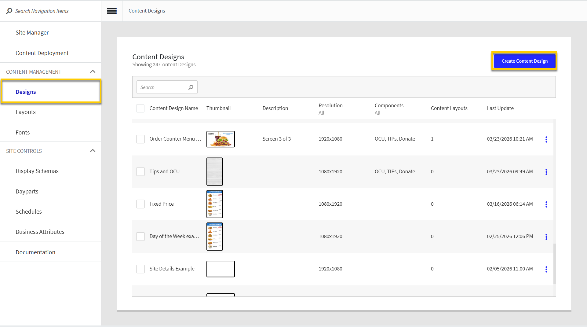
Create Content Design
→ → → →
To create a new Content Design:
From the upper-right of the Content Designs homepage, select Create Content Design.
From Content Design Settings, define the following:
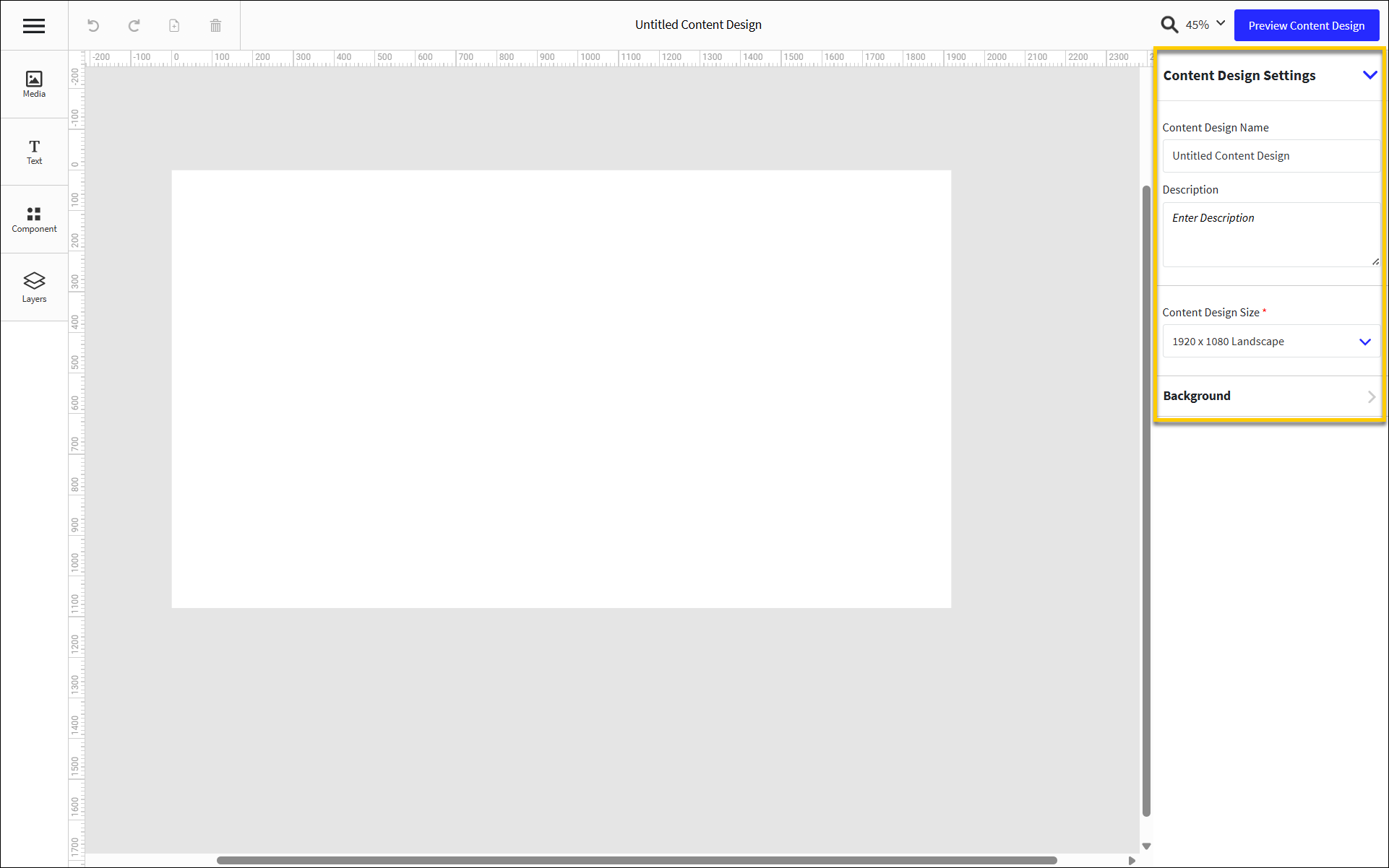
Field
Description
Content Design Name
Name of Content Design
Description
Description of Content Design
Content Design Size
Select the prefered resolution for Content Design
Background Color
Select the tile to set a background color for the Content Design
Use Content Designer to add and configure the content components:
Component
Description
Add a customizable, customer-facing Donation screen component.
Upload image files and configure their size and location on the layout.
Add a collection of components that are displayed consecutively on an infinite loop at a specified duration. A carousel can include any combination of images, videos, and/or price components.
An OCU displays order details to the customer, including:
Order Item list with respective quantities and modifiers.
Order total summary, including sub total, tax, and applied discounts.
Add and format a product pricing component. Optionally associate a product with the component.
Add text components and define their size, location, font, and color.
Add a customizable, customer-facing Tip Screen component. The Tip Screen component includes a screen from which the customer can select a predefined tip, and a screen from which the customer can enter a custom tip.
Upload video files and configure their size and location on the layout.
Nota
The Content Design is automatically saved after each user action.
From the upper-right of the Content Designer, select Preview Content Design to see a preview in a separate browser window.
From the upper-left of the Content Designer, select the "hamburger" icon.
From the dropdown, select Exit Content Design.
Align Components
When configuring a component, the following alignment tools are available from the top of the right pane.
| Align the component on the left side of the screen. | |
| Move the component to the center of the screen. | |
| Align the component on the right side of the screen. | |
| Align the component along the top of the screen. | |
| Move the component to the center of the screen without changing its horizontal placement. | |
| Align the component along the bottom of the screen. | |
| To equally distribute horizontal and/or vertical spacing between selected components:
|


Sugerencia
Use the arrow keys on the keyboard to nudge an item on the screen one (1) pixel at a time in the respective direction.
To nudge an item ten (10) pixels at a time, hold down Shift and then select the applicable arrow key on the keyboard.
Manage Layers
From the Layers pane of the Screen Designer, manage the content layers of a DMB screen. Right-click a layer to open a popup menu and perform the following actions:
Action | Description |
|---|---|
Copy | Copy the selected component to the clipboard. |
Paste | Paste the contents of the clipboard. |
Hide | Hide the layer from view. |
Lock | Make the contents and properties of the layer non-editable. |
Bring Forward | Bring the selected layer forward if it is behind another layer. |
Bring To Front | Bring the selected layer forward to the foreground of the screen. |
Send Backward | Move the selected layer backward to position it behind another layer. |
Send to Back | Move the selected layer backward and make it the lowest layer. |
Group Layers | Create a group that contains multiple layers and define the coordinates for the group. |
Create Carousel | Add a collection of components that are displayed consecutively on an infinite loop at a specified duration. A carousel can include any combination of images, videos, and/or price components. |
Delete | Remove the selected layer from the screen. |
Group Layers
To create a group of layers:
From the menu pane on the left, select Layers to open the Layers pane.
Hold down Ctrl on the keyboard, and then select the layers to include in the group.
From the Layers pane, right-click one of the selected layers.
From the popup menu, select Group Layers.
From the right pane, define the following:
Field
Description
Name
Type a name for the group.
Select the lock icon to make the component properties non-editable.
Toggle the eye icon to hide/show the component.
X and Y
Type the desired X and Y coordinates for the component.
When the position of the component is manually adjusted on the screen, the X and Y field values are updated automatically.
W and H
Type the desired width and height of the component.
When the width and height of the component is manually adjusted, the W and H field values are updated automatically.
Description
Type a description of the group.
Sugerencia
From the Layers pane, drag and drop layers to add them to an existing group.
Ungroup Layers
To ungroup a collection of layers:
From the Layers field, right-click the group folder.
From the popup menu, select Ungroup.
Create Media Carousel from Layers
→ → → →
A media carousel is a collection of components that are displayed consecutively on an infinite loop at a specified duration. A carousel can include any combination of images, videos, and/or price components.
To create a media carousel from existing layers:
From the menu pane on the left, select Layers to open the Layers pane.
Hold down Ctrl on the keyboard, and then select the layers to include in the carousel.
From the Layers pane, right-click one of the selected layers.
From the popup menu, select Create Carousel.
From the pane on the right, define the following:
Field
Description
Name
Type a name for the carousel. The default name is "Carousel".
Select the lock icon to make the component properties non-editable.
Toggle the eye icon to hide/show the component.
X and Y
Type the desired X and Y coordinates for the component.
When the position of the component is manually adjusted on the screen, the X and Y field values are updated automatically.
W and H
Type the desired width and height of the component.
When the width and height of the component is manually adjusted, the W and H field values are updated automatically.
Transitions
From the dropdown, select the desired effect to use when transitioning from one component to another.
From the lower-right of the right pane, sort the carousel components and specify the amount of time to display each component:
Select and drag the control to the left of the listed components to sort them in the desired sequence.
In the Duration(s) field for each listed component, type the number of seconds to display the component before transitioning to the next component in the carousel.
Select Auto to play the video at its original length. This option is only available for video files.
The Loop field specifies the number of seconds it takes to cycle through one loop of the carousel.
From Visibility Requirements, edit visibility requirements for the component.
Sugerencia
From the Layers pane, drag and drop layers to add them to an existing carousel.